How to Pick the Perfect Color Palette for Your Home
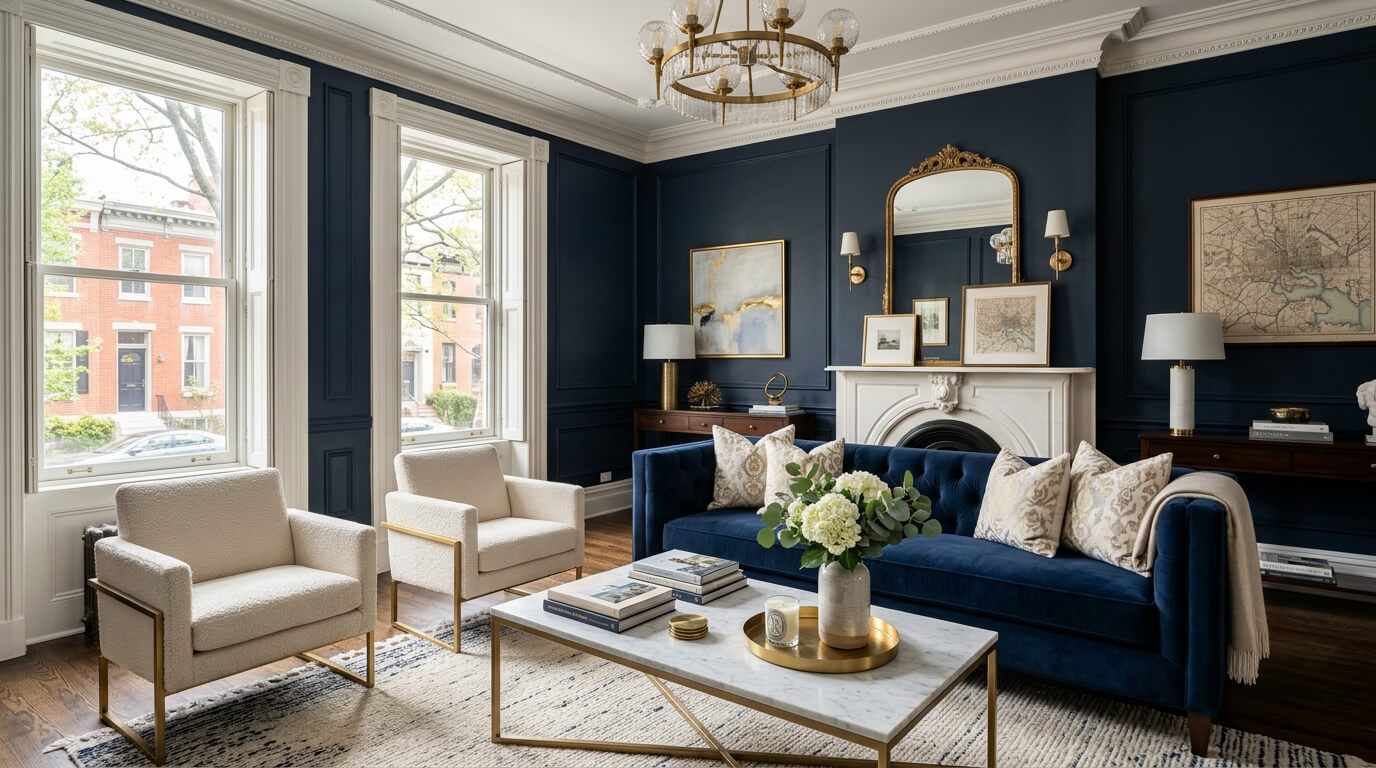
(Without Spiraling in the Paint Aisle)
There are few experiences more humbling than standing in front of a wall of paint swatches, confidently selecting “Soft Linen,” bringing it home, and discovering it is—somehow—bright yellow.
Choosing a color palette sounds simple. Until you realize there are approximately 47 shades of white, all with strong opinions.
For East Coast professionals in Washington, DC, Baltimore, and Pennsylvania—where homes often blend historic charm with modern updates—color matters. It sets the tone, defines the flow, and determines whether your home feels calm and elevated… or like each room has a separate personality and no shared calendar.
The good news? You don’t need a design degree or a minor breakdown to get it right.
You just need a plan.
A color palette isn’t just a collection of colors you like. It’s a coordinated system that guides every visual decision in your home.
A strong palette:
Creates flow from room to room
Supports your furniture and materials
Feels intentional, not accidental
Allows variation without chaos
Think of it as your home’s wardrobe. Everything doesn’t have to match—but it should all belong to the same story.
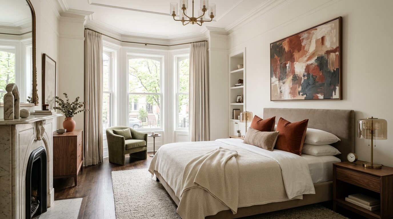
Before you even look at colors, ask yourself:
How do I want my home to feel?
Not what’s trending. Not what looked good in someone else’s townhouse. What you want to experience daily.
Common directions:
Calm and minimal
Warm and inviting
Sophisticated and moody
Light and airy
Your answer will guide everything that follows.
Because picking colors without defining the mood is how you end up with a living room that says “spa retreat” and a kitchen that says “espresso-fueled ambition.”
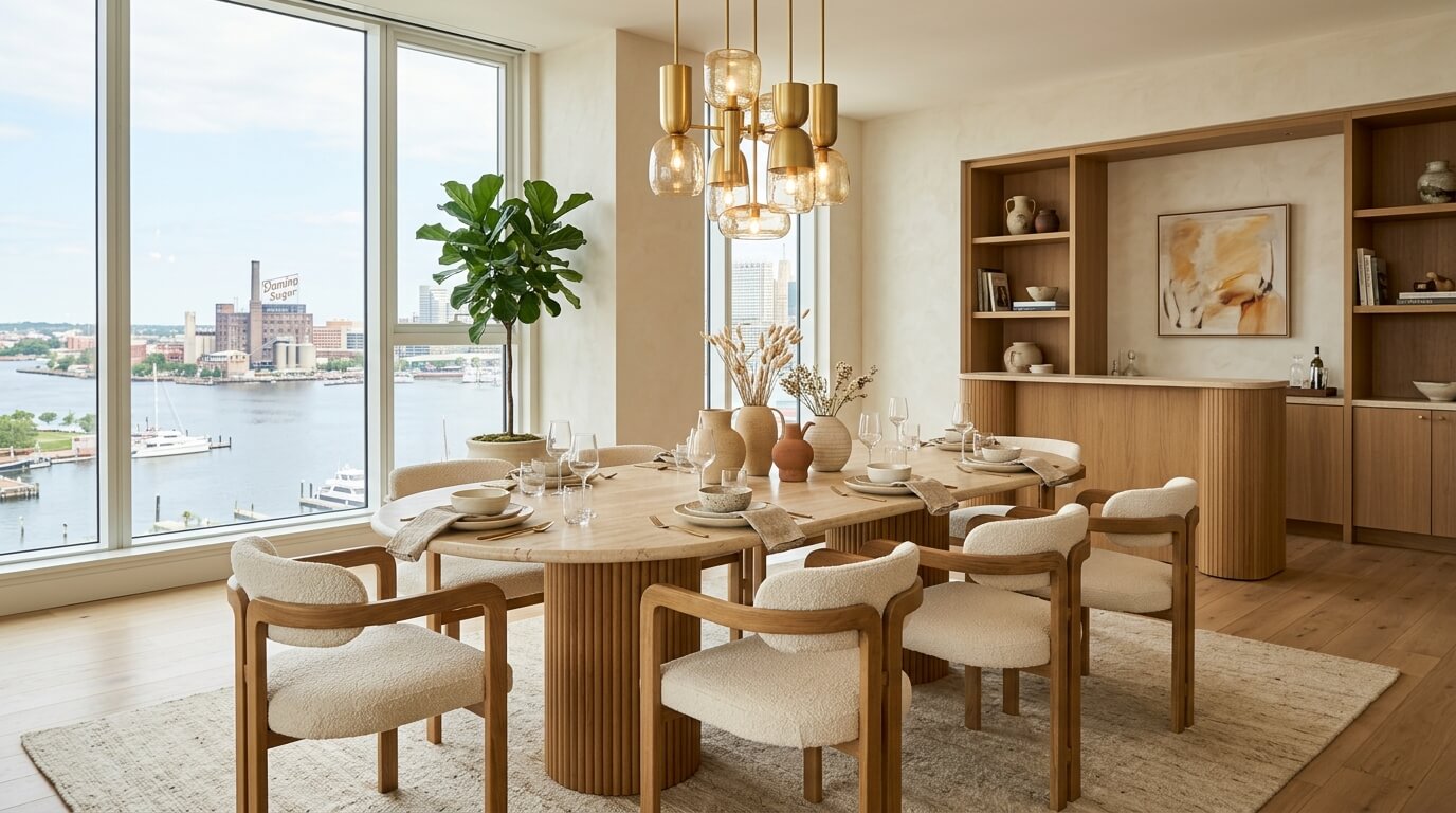
A well-designed home doesn’t rely on endless color variety. It relies on consistency with flexibility.
A reliable formula:
2–3 neutral base colors (walls, large furniture)
2–3 accent colors (textiles, decor, art)
1 grounding tone (black, navy, charcoal, deep green)
These colors should appear in different ways across your home—not necessarily in every room, but often enough to create continuity.
Example:
Living room: warm white walls, navy accents, brass details
Bedroom: soft taupe walls, navy textiles, wood tones
Kitchen: white cabinetry, brass hardware, subtle navy elements
Same palette, different expressions.

Neutrals are not boring. They are foundational—and surprisingly complex.
Key considerations:
Undertones matter (warm vs. cool)
Lighting will change everything
What looks white in the store may look beige, gray, or green at home
Popular modern neutrals:
Warm whites (soft, creamy—not stark)
Greige (gray + beige, the diplomat of colors)
Taupe (rich, warm, slightly elevated)
For East Coast homes—especially older ones—warmer neutrals often complement architectural details better than cooler tones.

Before you commit to a palette, look at what you can’t change easily:
Flooring
Cabinetry
Countertops
Tile
Large furniture pieces
Your palette should work with these elements—not against them.
If your floors are warm-toned wood, a cool gray palette may feel disconnected. If your countertops have veining, your colors should complement—not compete.
Design is much easier when you stop trying to override what already exists.
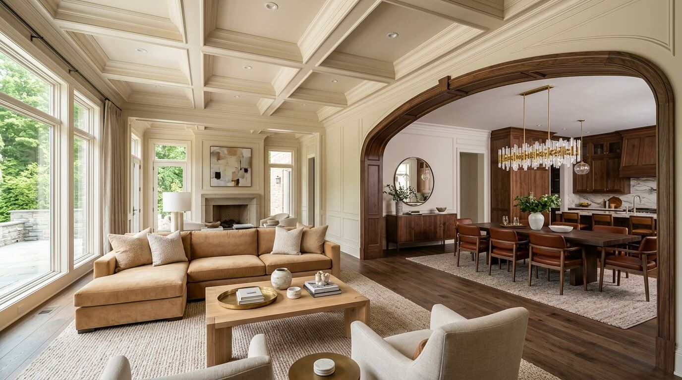
In many East Coast homes—especially rowhomes and open layouts—rooms are visible from one another.
This is where color flow becomes essential.
Ways to create it:
Repeat key colors across spaces
Use variations of the same tone (lighter/darker)
Carry materials and finishes from room to room
You don’t need identical rooms. You need visual relationships.
Think of it like a well-structured conversation—each room adds something new, but stays on topic.
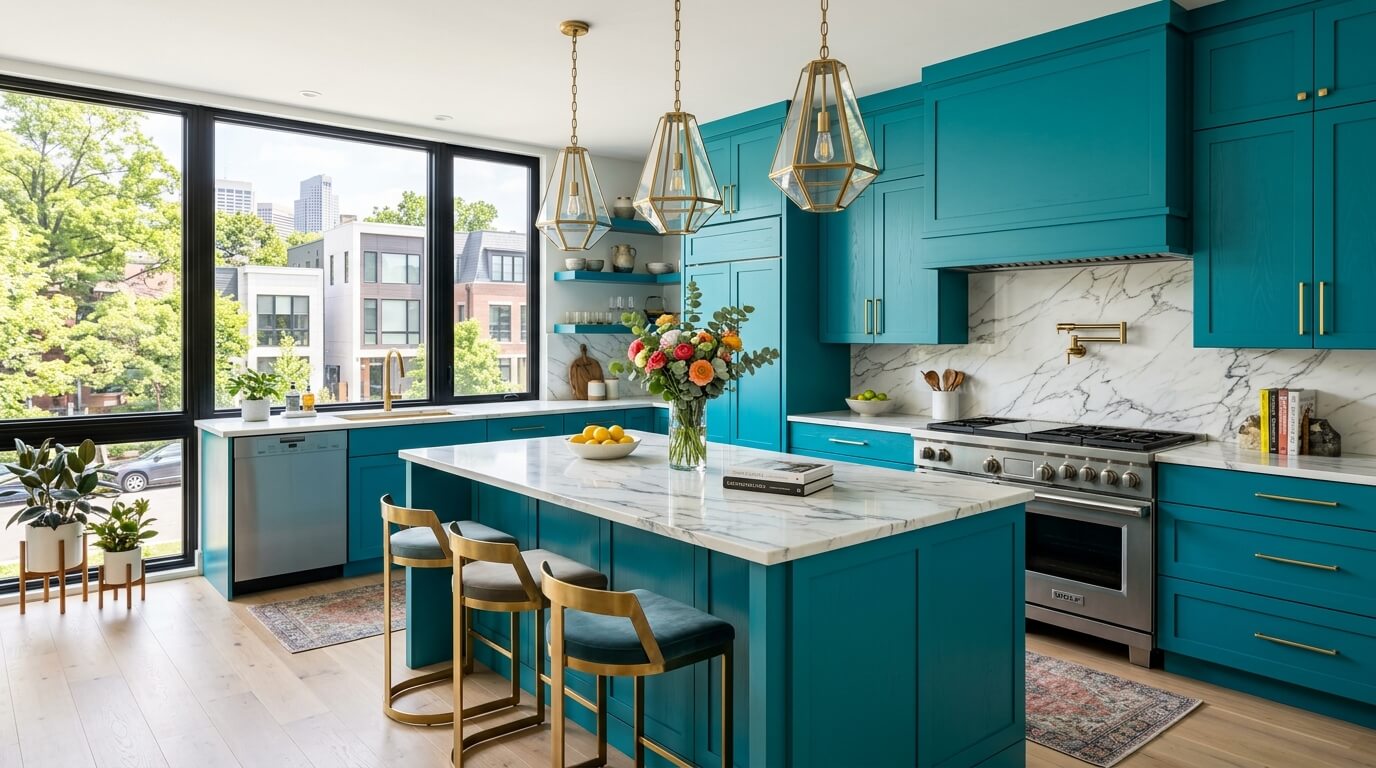
If neutrals are the structure, accent colors are the personality.
This is where you can:
Introduce color you love
Add contrast and interest
Reflect your personal style
For a high-end look:
Choose slightly muted, complex tones
Avoid overly bright or primary colors (unless used very intentionally)
Repeat accents in small but meaningful ways
A navy pillow, a piece of art, and a ceramic vase in the same tone? That’s cohesion.
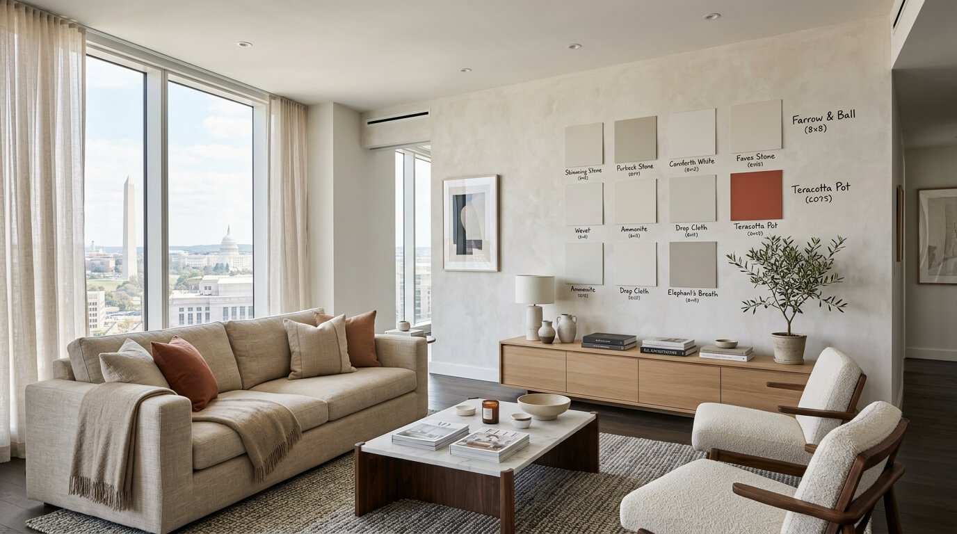
Never commit to a color without testing it in your space.
Paint samples:
On multiple walls
In different lighting (morning, afternoon, evening)
Next to your furniture and finishes
What looks perfect under store lighting can look entirely different in your home.
This step feels tedious. It is also the difference between “exactly right” and “why does this look green?”
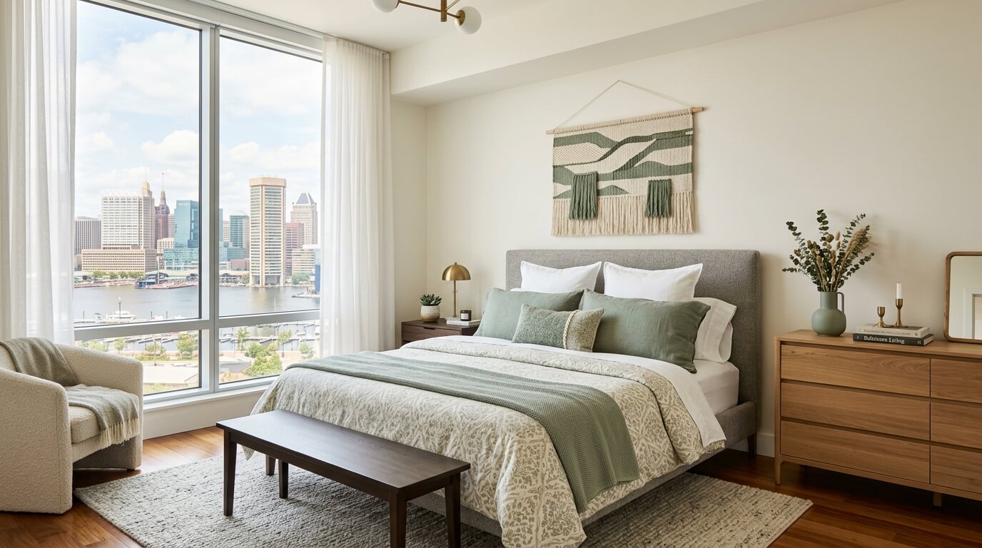
One of the most common mistakes is giving every room equal visual intensity.
Instead:
Let some rooms be calm and neutral
Let others carry more color or contrast
This creates rhythm throughout your home.
If every room is bold, nothing stands out. If every room is neutral, things can feel flat.
Balance is the goal.

Smaller Spaces (DC apartments, compact layouts):
Stick to lighter palettes
Limit contrast
Use repetition to create flow
Larger Homes (Pennsylvania, suburban layouts):
You can introduce more variation
Layer deeper tones
Create distinct but connected spaces
The size of your home should influence how bold your palette becomes.

Yes, certain colors trend. No, your entire home should not revolve around them.
Timeless palettes:
Lean on neutrals
Use trends in accents (pillows, art, decor)
Prioritize longevity over novelty
You’ll thank yourself later when you don’t feel compelled to repaint everything in two years.
A Foolproof Palette Formula
If you want a reliable, elevated starting point:
Warm white walls
Soft taupe or greige secondary tone
Deep navy or charcoal accent
Natural wood for warmth
Brass or black for contrast
It’s classic, flexible, and works in nearly any East Coast home.
Final Thoughts: Color Is the Quiet Power Player
When done well, a color palette doesn’t demand attention—it supports everything else.
It makes your home feel:
Cohesive
Calm
Elevated
Intentional
And for professionals balancing full schedules and full lives, that kind of environment isn’t just nice—it’s necessary.
Because the best homes don’t just look good. They feel like everything is exactly where it should be—even if it took you six samples to get there.
Hudson & Crane is an interior designer in Washington, D.C. serving residential clients in D.C., Maryland, and Northern Virginia.

