
Let’s face it: color can be intimidating. One moment you’re calmly admiring your minimalist beige living room, the next you’re questioning why your new “emerald accent wall” looks like a neon forest exploded in your apartment. For those of us with an eye for style—and perhaps a slightly overdeveloped sense of taste—using bold colors without turning a space into a chaotic rainbow can feel like navigating the DMV on a Monday morning: daunting but not impossible.
Let us walk you through some of the most common styles to see what fits you best. Then give Hudson & Crane a call to make it come to life in your home.
Why Bold Colors Matter
In the era of Instagram-worthy interiors and high-gloss design magazines, bold colors are no longer just for adventurous artists or eccentric chefs. They’re a statement. They say, “I have confidence, I know what I like, and yes, I own more than one silk scarf in this color palette.” In the DC area, where brownstones, contemporary condos, and historical row houses coexist like caffeinated roommates in a shared studio, bold colors are the perfect way to inject personality into your home.
But here’s the rub: bold doesn’t mean “make your guests reach for their sunglasses.” The key is to add drama without inducing chromatic panic attacks.
Start Small, But Think Big
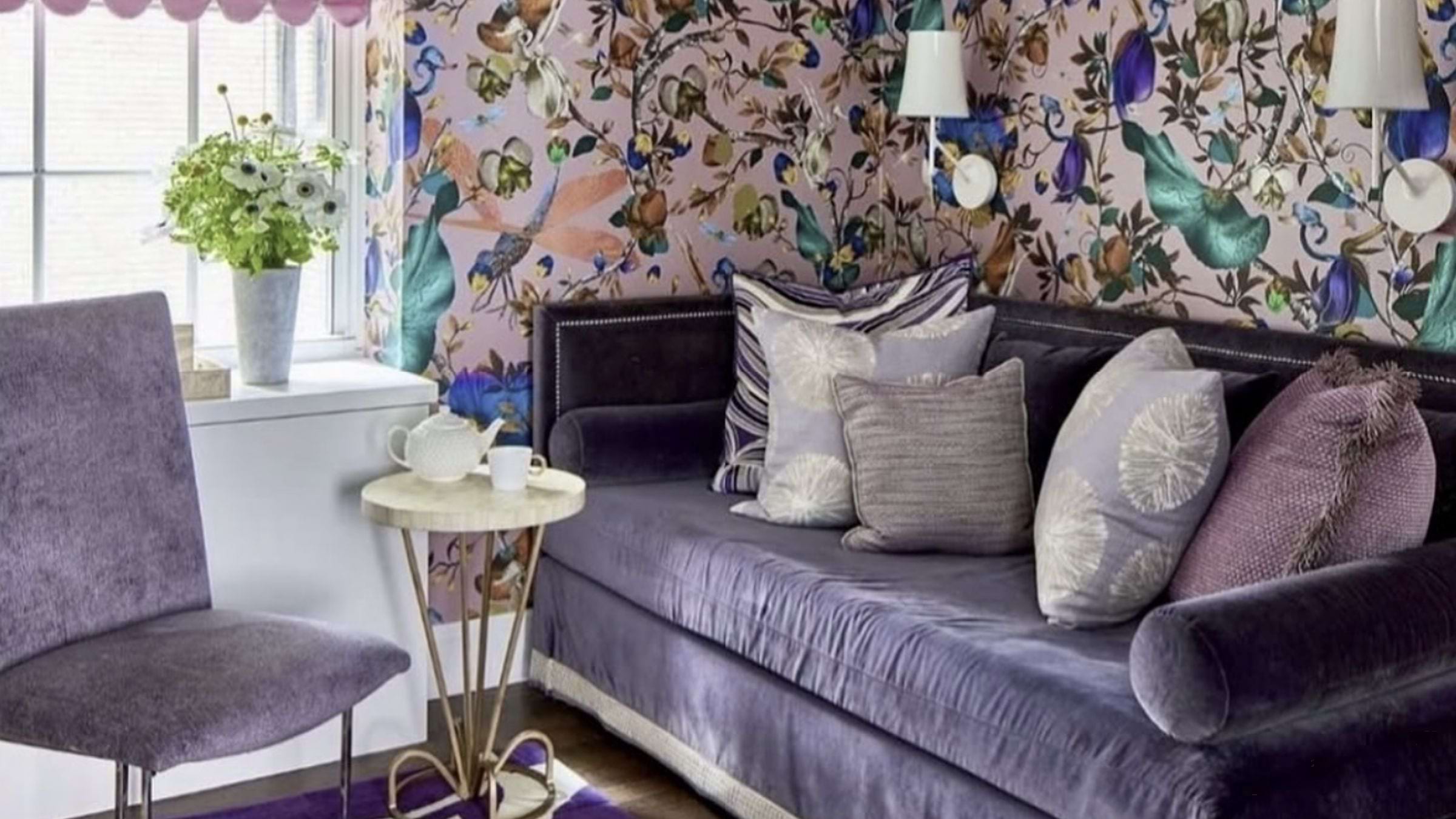
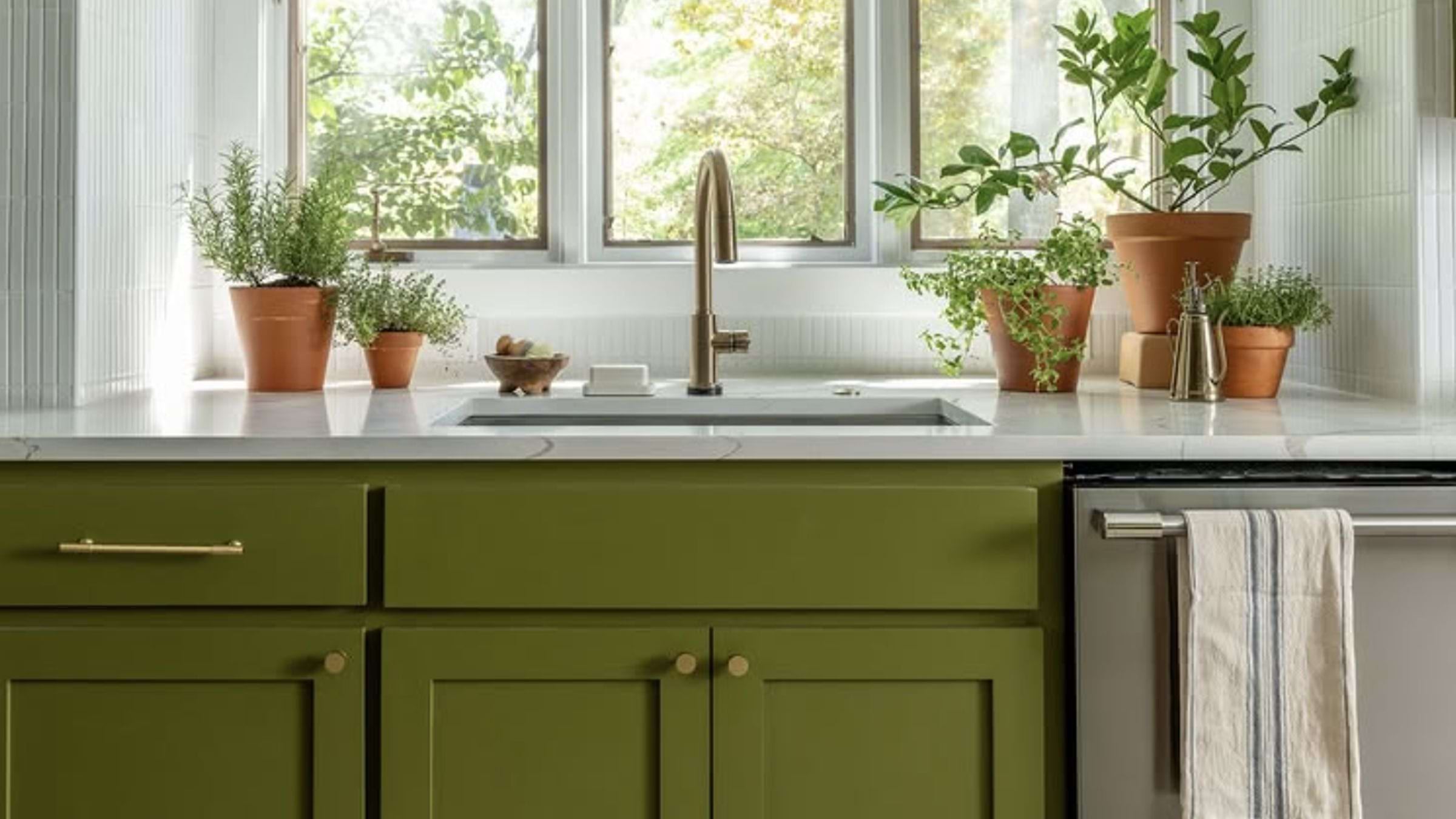 From @daveandjennymarrs on Instagram
The first rule of bold color is deceptively simple: start small. Think accent chairs, throw pillows, or a statement vase. In a city like DC, where your home may be as historic as your collection of congressional memoirs, a single daring piece of furniture can make a room feel curated rather than chaotic.
Take a cobalt-blue velvet chair in a neutral living room, for instance. It’s bold, it’s daring, and it doesn’t scream, “I’m in love with every Pantone color.” The chair becomes a conversation starter, an Instagram-worthy corner, and—if you’re like us—a fantastic place to sit dramatically while pretending to read The New Yorker.
Use the “60-30-10” Rule
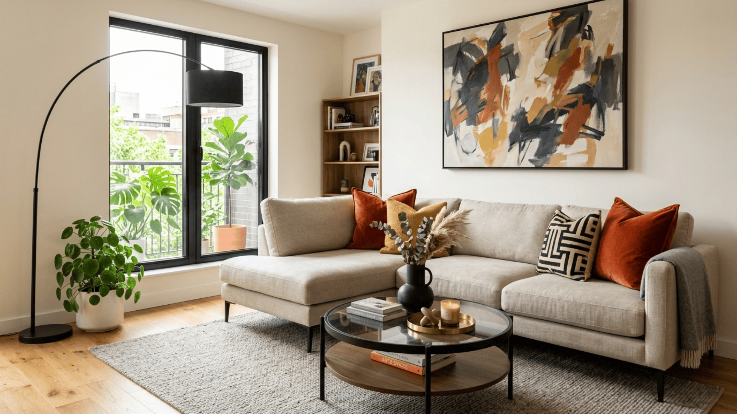
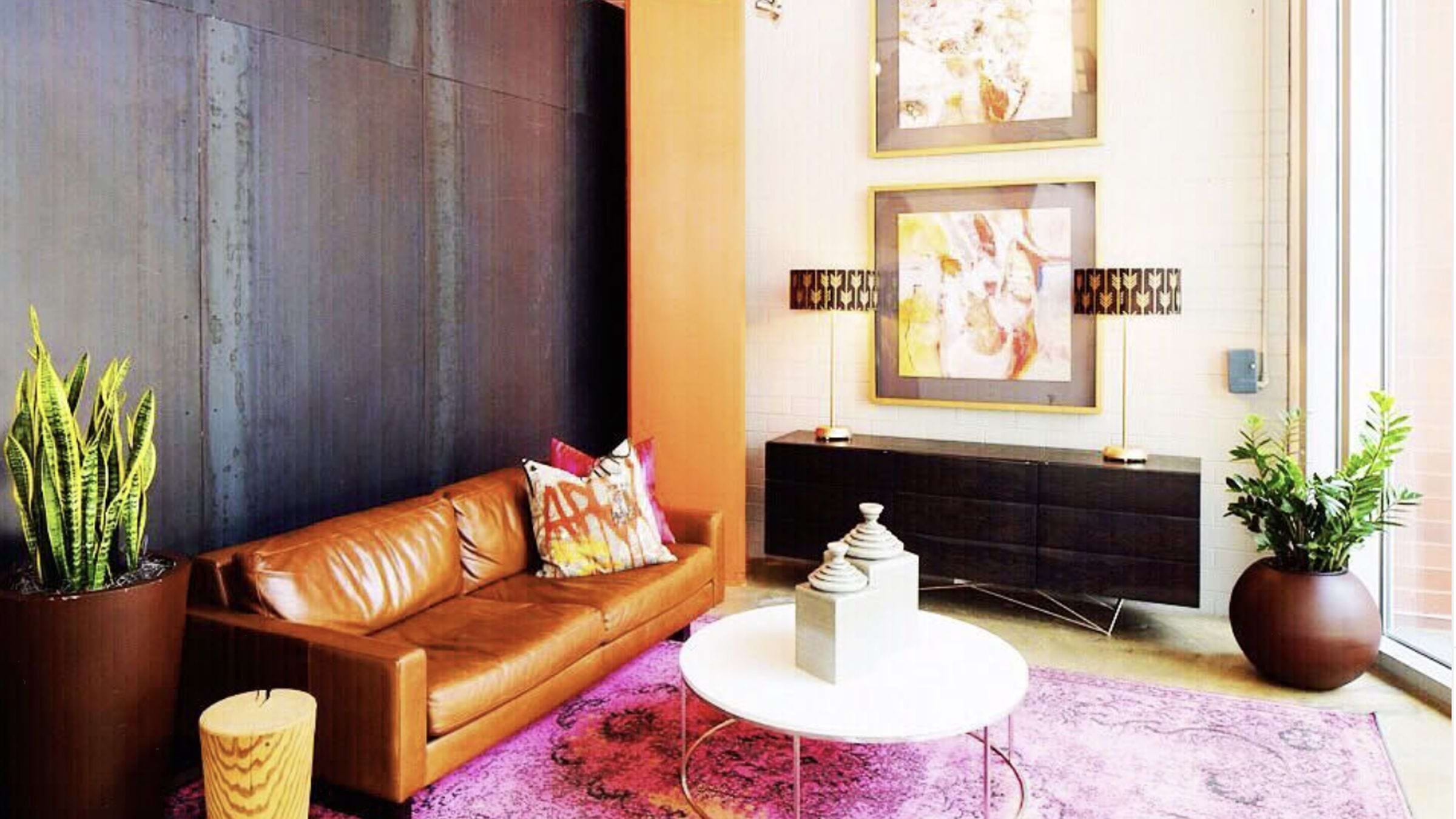 From @hudsonandcrane on Instagram
Interior designers love rules, probably because they secretly want to avoid awkward Pinterest fails. The “60-30-10” rule is one of the most reliable:
- 60%: A neutral base. This is your walls, large furniture pieces, and perhaps your collection of beige throw rugs that make your friends wonder if you own a single bold item.
- 30%: Secondary color. This could be a less vivid shade that complements your main accent wall, like a muted terracotta or soft teal.
- 10%: Pop of color. Here’s where you unleash your inner boldness—a shocking magenta pillow, a lime-green vase, or a golden-yellow ottoman that makes everyone do a double-take.
This formula helps even the most avant-garde DC apartment remain visually balanced, sophisticated, and not like an episode of Queer Eye gone rogue.
Let Art Lead the Way
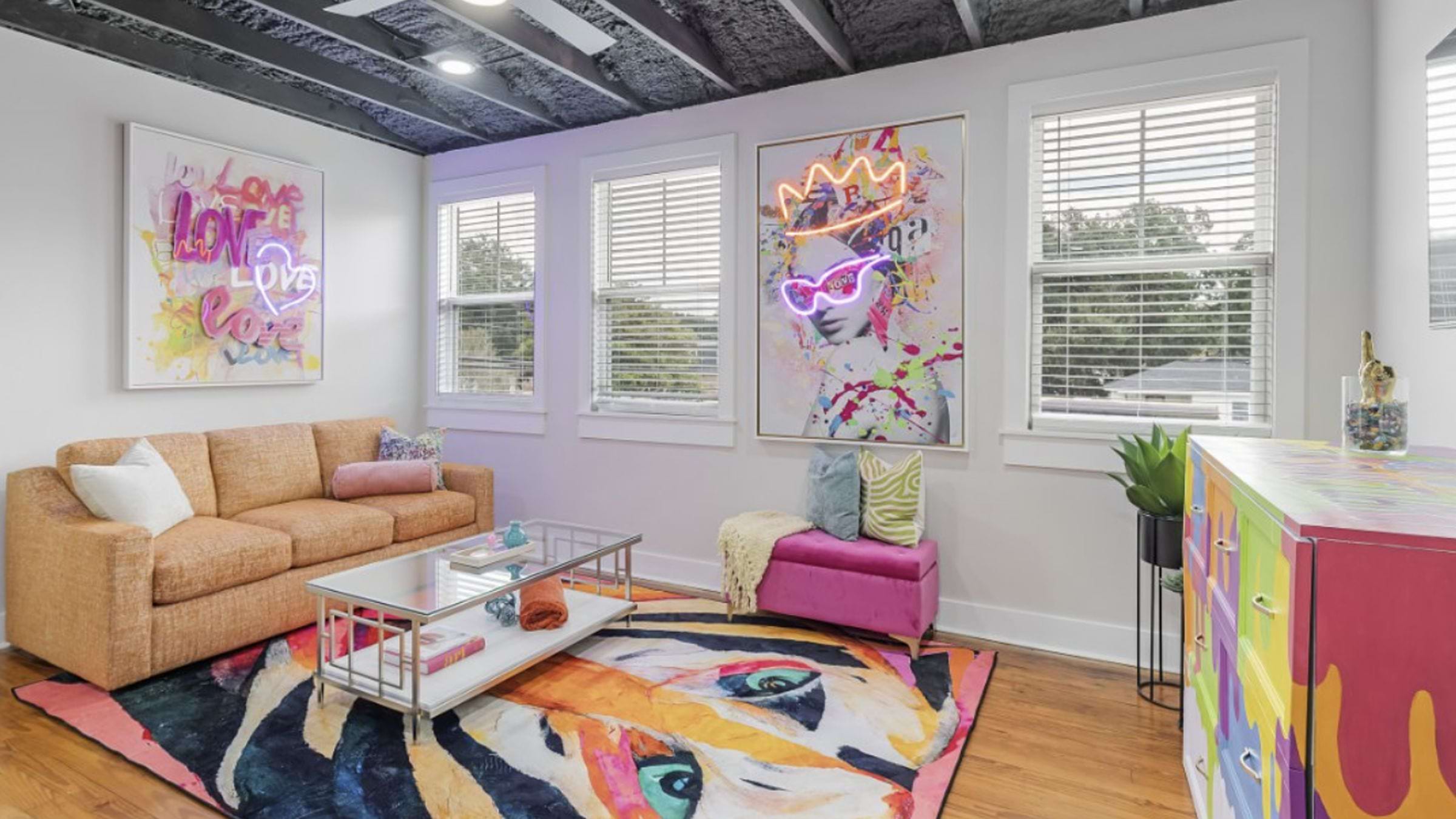
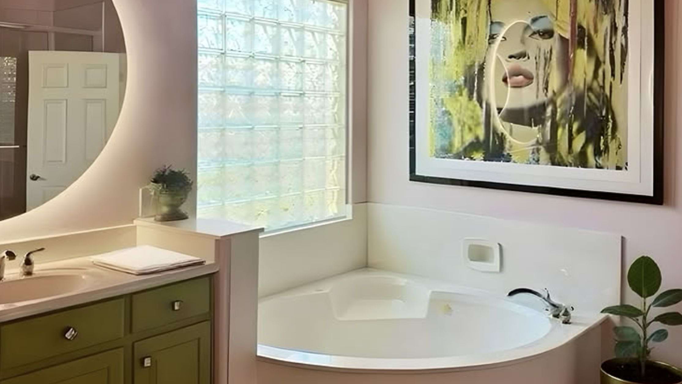 From @robyn_captureddesign on Instagram
If you’re nervous about committing to a bold color, let art do the heavy lifting. A vibrant abstract painting or a series of graphic prints can guide your palette and anchor the room. Consider a neon-hued painting above a muted sofa. Your eye will naturally be drawn to the artwork first, making the boldness feel intentional rather than haphazard.
Play With Texture
 From @nifelledesignco on Instagram
Here’s a trick that even seasoned designers occasionally forget: texture can make bold colors feel approachable. A velvet emerald pillow, a silk magenta throw, or a glossy cobalt ceramic vase can soften the intensity of color while keeping it prominent. In DC, where lighting can fluctuate from muted dawn to glaring afternoon, texture can help maintain a room’s warmth and accessibility.
And let’s be honest: velvet pillows just feel expensive. You want your guests to feel sophistication, not sensory overload.
 From @averyboardmanhq on Instagram
Stick to One Bold Hue
It can be tempting—oh, so very tempting—to combine every bold color under the sun. You might think, “Why not a lime sofa, turquoise walls, and fuchsia curtains?” But unless you are decorating a playhouse or planning to host a rainbow-themed gala, restraint is your friend. Pick one bold color and play with shades, textures, and finishes rather than introducing multiple competing colors.
This doesn’t mean your palette has to be boring. If your main bold color is royal blue, pair it with soft sky blue accents, navy throws, or indigo ceramics. The harmony feels intentional and luxurious.
Pair Bold Colors With Calm Neutrals
Even the most daring colors need a supportive cast. Warm whites, soft greys, and muted taupe can temper your bold choices and provide a visual “breathing room.” Think of neutrals as the DC metro of your room—they get everything moving smoothly without stealing the spotlight.
A burnt orange sofa, for instance, paired with a sandy wool rug and cream curtains, suddenly feels curated instead of chaotic. The neutrals let your bold choices shine without screaming, “Attention! I am your centerpiece!”
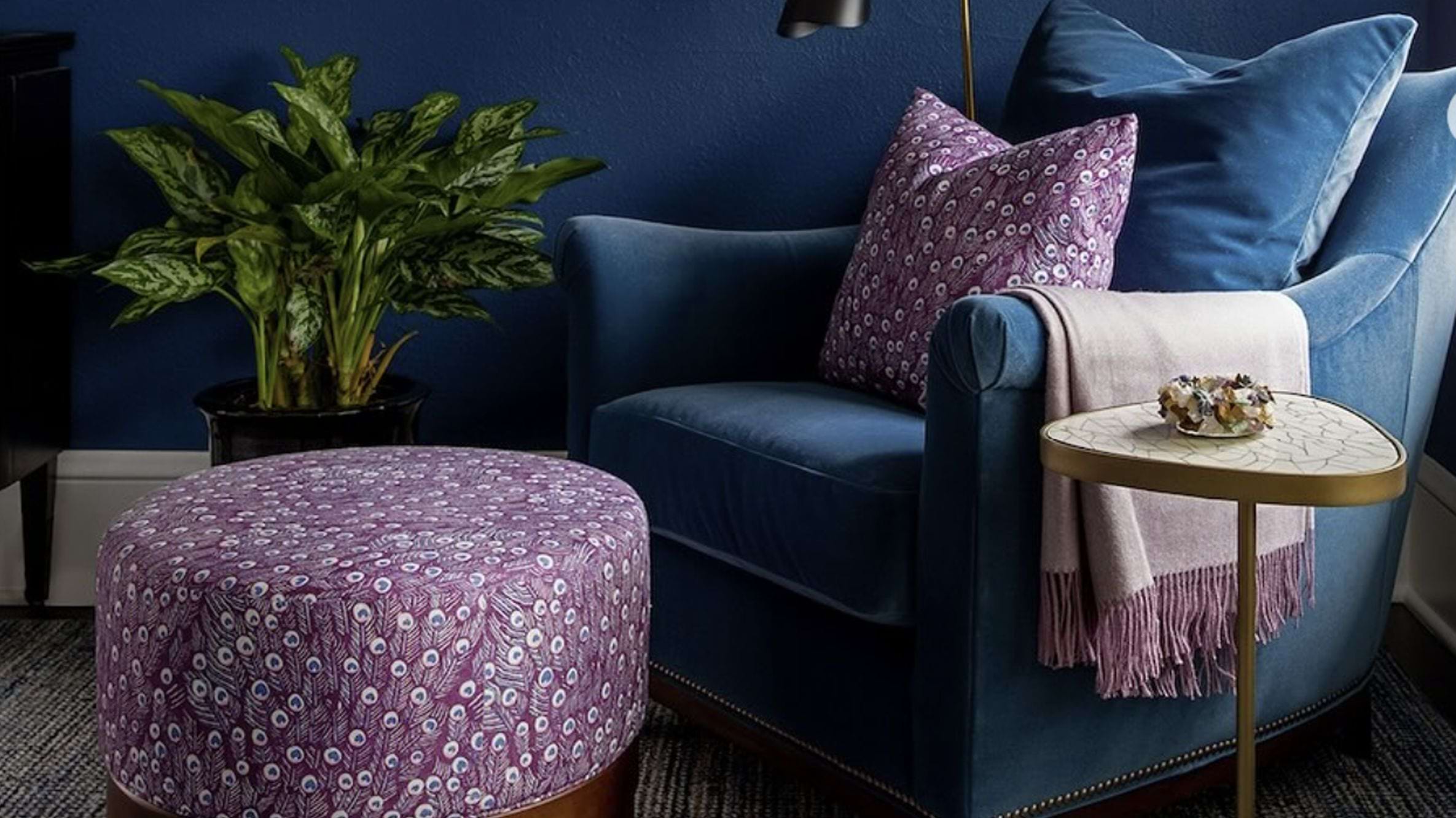
 From @jdsophisticatedstaging on Instagram
Consider Lighting
Lighting is often the unsung hero of bold interiors. Natural light can enhance vibrant colors, while poor lighting can turn your carefully chosen palette into a murky mess. In DC, sunlight varies drastically from the bright mornings of Georgetown to the shadowy corners of Foggy Bottom apartments.
Experiment with layered lighting: floor lamps, sconces, and subtle overhead fixtures can keep bold colors lively without harsh glare. Warm bulbs can soften intense reds and yellows, while cool bulbs can make blues pop dramatically.
 From @ambermarquesinteriors on Instagram
Boldness Doesn’t Have to Be Permanent
If you’re still hesitant, consider semi-permanent options: removable wallpaper, bold area rugs, or accent panels. These allow you to experiment without committing for life. Your DC townhouse might be a rental, after all, or you might just want the freedom to switch things up with the seasons. Bold colors, after all, are like politics: sometimes you need flexibility.
Finally, and perhaps most importantly: own your bold color choices. Confidence in design translates to sophistication. A room that feels deliberate rather than accidental signals that you know what you like.
Whether you’re entertaining colleagues, hosting a book club, or just lounging dramatically with a glass of Chardonnay, a confident bold palette makes a statement.
Let Hudson & Crane help you incorporate bold hues into your home.
Hudson & Crane is an interior designer in Washington, D.C. serving residential clients in D.C., Maryland, and Northern Virginia.