Let’s be honest. When you hear “neutral color palette,” your brain probably whispers “snooze-fest.” Visions of lifeless walls and soulless sofas flash before your eyes. Beige and gray—those two ever-present, noncommittal shades—have been unfairly accused of making interiors feel like waiting rooms at a tax office. But it’s time to clear their good name. Because neutral doesn’t mean boring. In fact, beige and gray (or, as their IG alter egos would say, “greige” and “taupe”) can be the most stylish, serene, and yes even, sexy foundation for your space—if you know what you’re doing. So buckle up, color adventurers, because we’re going on a joyride through the wildly underestimated world of neutrals. Spoiler alert: it involves cozy textures, sophisticated contrast, and a whole lot of “ooh, I never thought of that.”
The Beige Backlash: A Brief History of Boring
Beige has suffered a PR crisis for decades. Blame the 90s office cubicle, or that one rental apartment you moved into that had “Landlord Special Taupe” on every wall. Beige became synonymous with bland. Gray, meanwhile, got stuck in its own existential crisis—always moody, always misunderstood. But here’s the twist: in the hands of a clever designer, beige and gray are actually the chameleons of the color world. They can be warm or cool, minimalist or maximalist, modern or classic. They’re the blank canvas that actually knows how to throw a party.
Tone-on-Tone = Chic-on-Chic
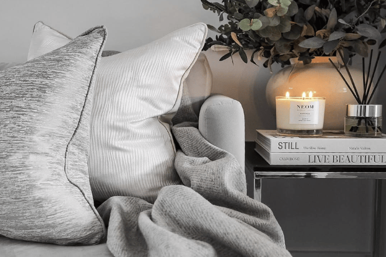
 From the Hudson & Crane Design Gallery The fastest way to make neutrals look intentional rather than accidental is to layer different shades of the same color family. We’re talking tone-on-tone action, baby. Think pale beige walls with caramel-toned leather chairs, a wool throw in soft taupe, and a shaggy cream rug that screams “yes, I drink almond milk lattes and I have my life together.” The same is true with gray. A slate-gray couch with dove-gray cushions and a silvery abstract painting? That’s not boring—that’s . Add in a matte black lamp and suddenly you’re living in a Scandinavian design magazine. Pro tip: When layering, mix textures—linen, leather, velvet, wool. It keeps things visually interesting and touchably luxe, even if everything is technically “just gray.”
Neutrals Love Drama (And That’s a Good Thing)
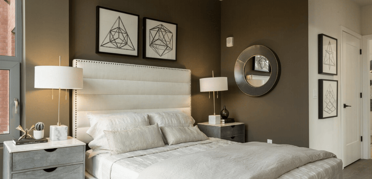
 From @vintagecrushin on Instagram Here’s a fun paradox: you can make a neutral space more dramatic than a reality show reunion. How? Contrast, darling. Use beige or gray as a calm base, then throw in some high-drama elements:
- A sculptural black chandelier
- Oversized modern art
- Dark espresso wood
- Moody navy or forest green accents
It’s the design equivalent of wearing a cashmere sweater with leather pants. Classy and a little rebellious.
The Return of Greige (And Why You Should Care)
 From @home_styling_by_ms on Instagram Yes, greige is back. (Was it ever gone? Debatable.) For the uninitiated, greige is the love child of gray and beige, and it somehow manages to be both warm and cool at the same time—like that friend who’s a yoga teacher and owns a motorcycle. Greige works literally everywhere: modern farmhouses, city apartments, beach houses, your weird cousin’s tiny home. It flatters every style. Paint your walls greige and watch as your furniture suddenly looks more expensive, your lighting more romantic, and your plants greener. It’s the closest thing to an Instagram filter for your entire living room.
Add a Pop, But Make It Intentional
 From the Hudson & Crane Design Gallery
“Add a pop of color!” said every HGTV host ever. But with neutrals, the key is restraint. You don’t want to go full clown car just because your sofa is beige. Try this instead:
- A single emerald-green velvet pillow
- Burnt orange dining chairs
- A cobalt blue ceramic vase
One bold moment makes the neutrals feel deliberate, curated, even glamorous. It’s like when someone wears all black and red lipstick—it hits harder. And let’s face it: nothing makes a “pop” pop more than a calm, neutral backdrop. Beige is the hype person to your accent color’s Beyoncé.
Go Big on Texture
 From @homebymkdesign on Instagram
In a neutral space, texture is your best friend. Without color doing the heavy lifting, you need surfaces to do the talking. Some ideas:
- Chunky knit throws
- Bouclé or sherpa accent chairs (a.k.a. adult teddy bear seating)
- Jute rugs
- Brushed brass hardware
- Raw wood coffee tables
These textures add warmth, dimension, and a sense of intentional coziness—you know, the kind that says “I make sourdough bread for fun and read hardcovers with the jacket off.”
Play With Pattern (Subtly)
 From @lauren_sanchez_design on Instagram
Just because you’re working with neutral tones doesn’t mean you have to go pattern-free. Incorporate soft patterns—like a delicate herringbone, a tone-on-tone stripe, or a classic plaid in taupe or cream. These add sophistication without the visual noise. Or go bolder with one statement pattern, like a Moroccan tile backsplash in gray and white, or a large-scale abstract wallpaper in charcoal tones. Suddenly, your beige walls don’t look so basic anymore.
Lighting = Magic
 Image from @HudsonandCrane on Instagram
Lighting is to neutral rooms what a good ring light is to an influencer: absolutely everything. Neutrals reflect and absorb light in ways that can either make a space glow like a sunset or feel like you’re living in a beige cave. Here’s how to win:
- Use layered lighting: overhead, task, and ambient
- Warm bulbs work best with beige; cool bulbs make gray feel crisp
- Highlight textured surfaces with directional light
Bonus move? An oversized mirror to bounce that golden-hour glow around your neutral paradise.
Neutrals in Every Room
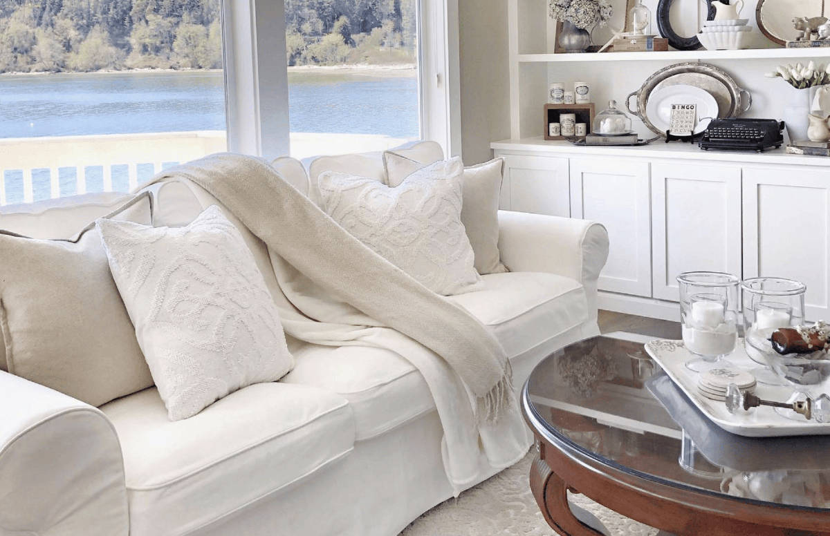
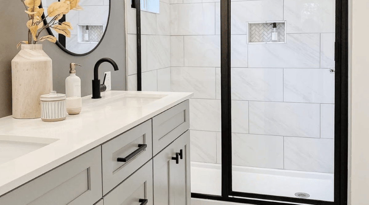 Image from @CottageandKey on Instagram Still not convinced? Let’s take a quick tour:
- Bedroom: Beige bedding layered with cream, ivory, and taupe = hotel-level serenity. Add a charcoal headboard and feel instantly five-star.
- Bathroom: Gray tile with matte black fixtures? Chic. Add in a wood stool and some fluffy white towels and pretend you’re at a Scandinavian spa.
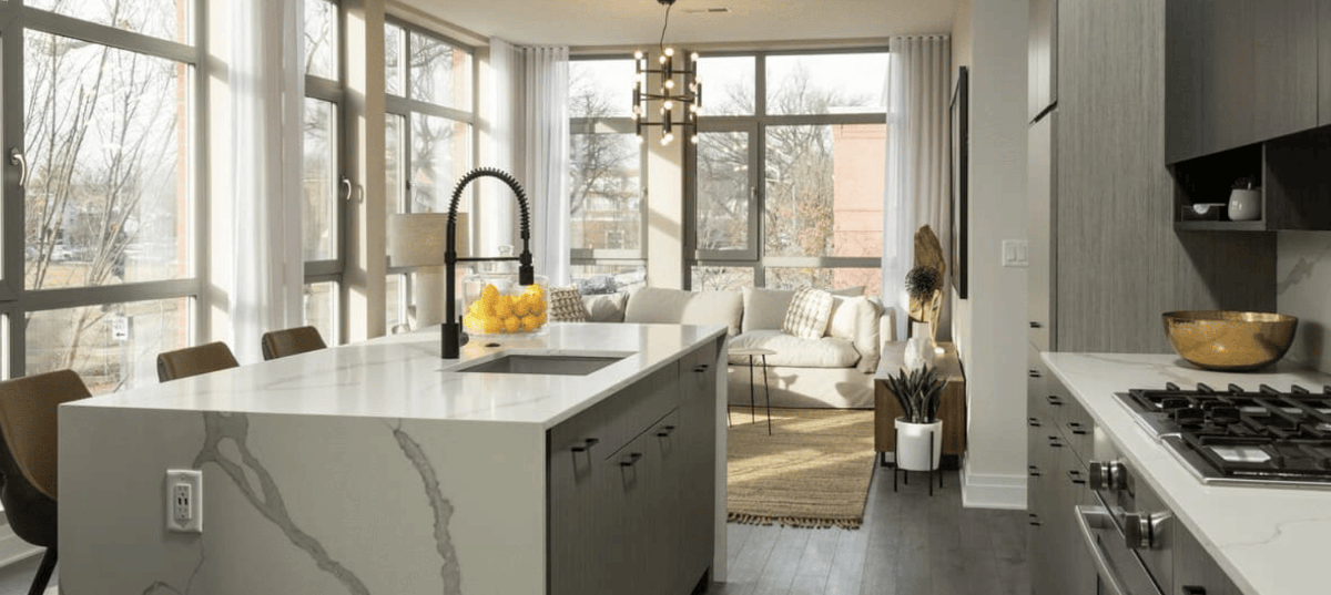
- Kitchen: Greige cabinets, marble countertops, brass hardware. It’s not just neutral—it’s Michelin-star neutral.
- Living Room: Beige sectional, gray area rug, white walls, one mustard velvet chair. The vibes? Immaculate.
When in Doubt, Beige It Out
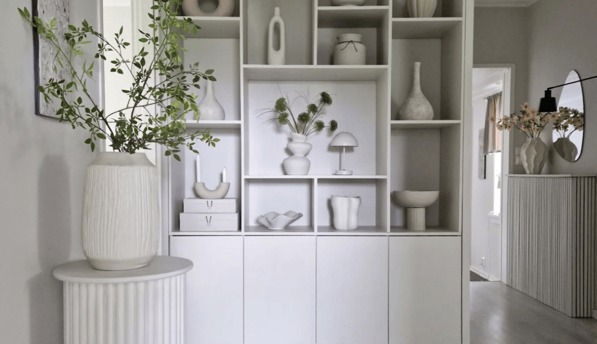
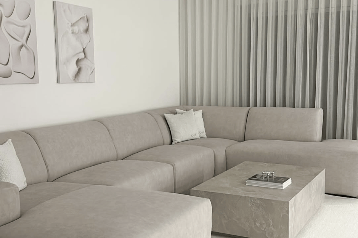 Image from @oezlems_interior on Instagram
Here’s a controversial opinion: beige is the real hero of minimalist design. It’s warm without trying too hard. It’s the color equivalent of a soft whisper that says, “You’re safe here. Also, have a matcha latte.” Use beige to calm a space that feels chaotic, to brighten a room that lacks natural light, or to make your houseplants feel like Instagram stars. Pair it with white for a fresh palette or with darker neutrals for contrast and depth.
Final Word: Beige and Gray Deserve a Second Chance
If you take one thing away from this post, let it be this: neutrals are not boring—bad design is boring. Beige and gray are the quiet MVPs of interior design. They’re timeless, versatile, and when used creatively, can deliver major style without screaming for attention. So go forth and beige boldly. Gray with confidence. Build that neutral palette and then break every “rule” in the book with texture, contrast, and a splash of weird. Your house doesn’t have to look like a Crate & Barrel catalog unless you want it to. It can look like you—just with better lighting.
Ready to give neutrals the glow-up they deserve? Tag us on Instagram @hudsonandcrane with your beige + gray masterpieces or inspo.
Hudson & Crane is an interior designer in Washington, D.C. serving residential clients in D.C., Maryland, and Northern Virginia.