
If kitchens had an Oscars night, color schemes would be the best-dressed nominees. While trends come and go faster than you can say “avocado toast,” certain kitchen color schemes stand the test of time. Whether you’re renovating, designing from scratch, or just dreaming of a Pinterest-worthy space, here are the best color schemes for a timeless kitchen that won’t make you cringe in five years. (Looking at you, 1970s mustard yellow and brown.)
1. Classic White: The Meryl Streep of Kitchens
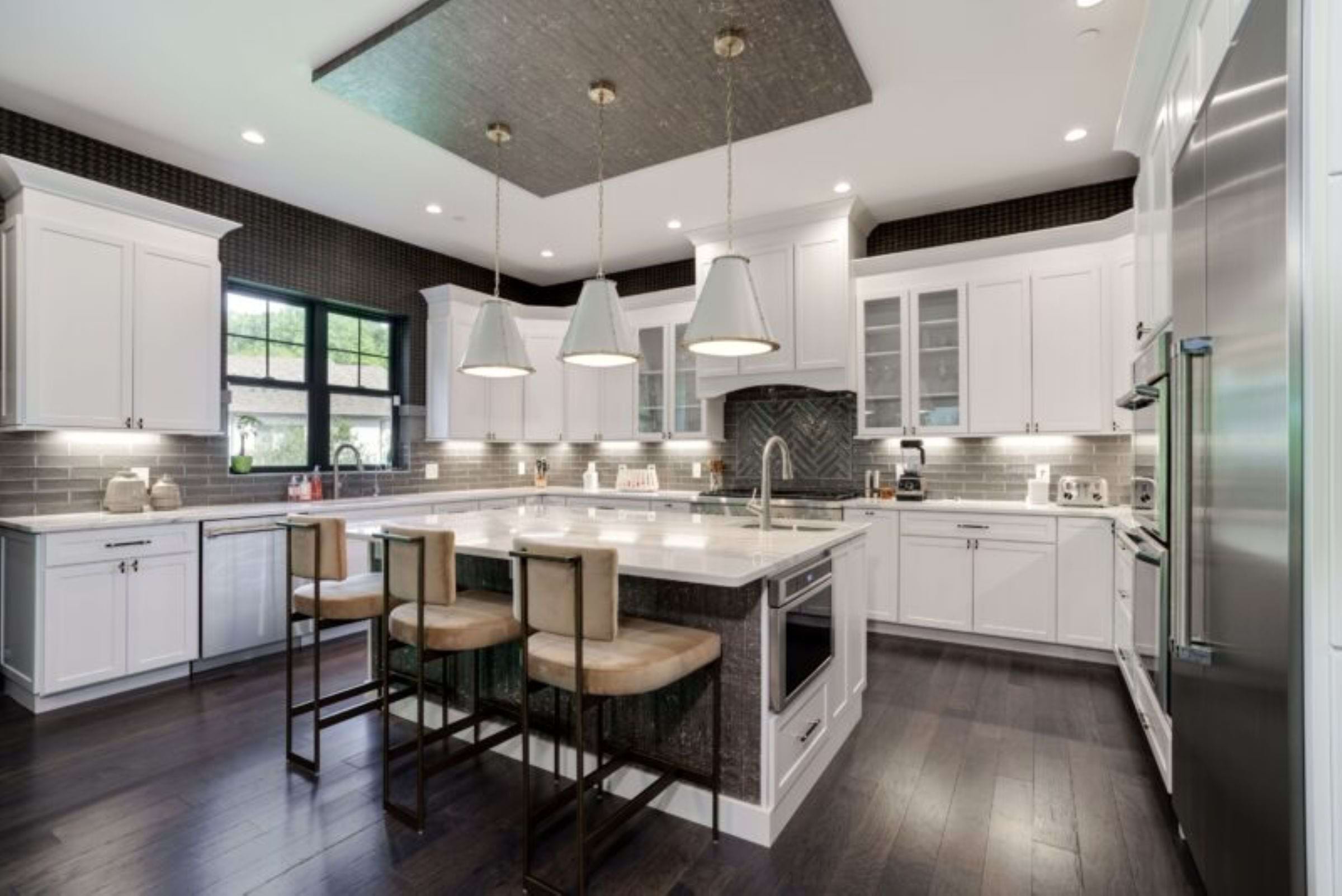
From the Hudson & Crane Design Gallery
If there’s one color scheme that never goes out of style, it’s white. White kitchens are like Meryl Streep—elegant, versatile, and they always steal the show. Whether you go for crisp, cool whites or warm, creamy tones, this scheme makes your space look bigger, brighter, and effortlessly chic.
Why it works:
- Reflects light, making small spaces feel bigger
- Pairs well with literally everything
- Allows accent pieces (like statement lighting or funky bar stools) to shine
A white color scheme creates a sense of openness, tranquility, and sophistication. White enhances natural light, making the space feel open, airy, and inviting. It serves as a versatile canvas that pairs beautifully with any style—from sleek modern to classic farmhouse. White cabinetry, countertops, and backsplashes create a cohesive and polished look, while subtle texture variations, like subway tiles or marble veining, add visual interest.
To prevent the space from feeling sterile, warm accents such as wood, brass, or woven textures can be introduced. A white kitchen feels crisp, elegant, and effortlessly adaptable to changing trends.
2. Black and White: The Tim Burton Classic
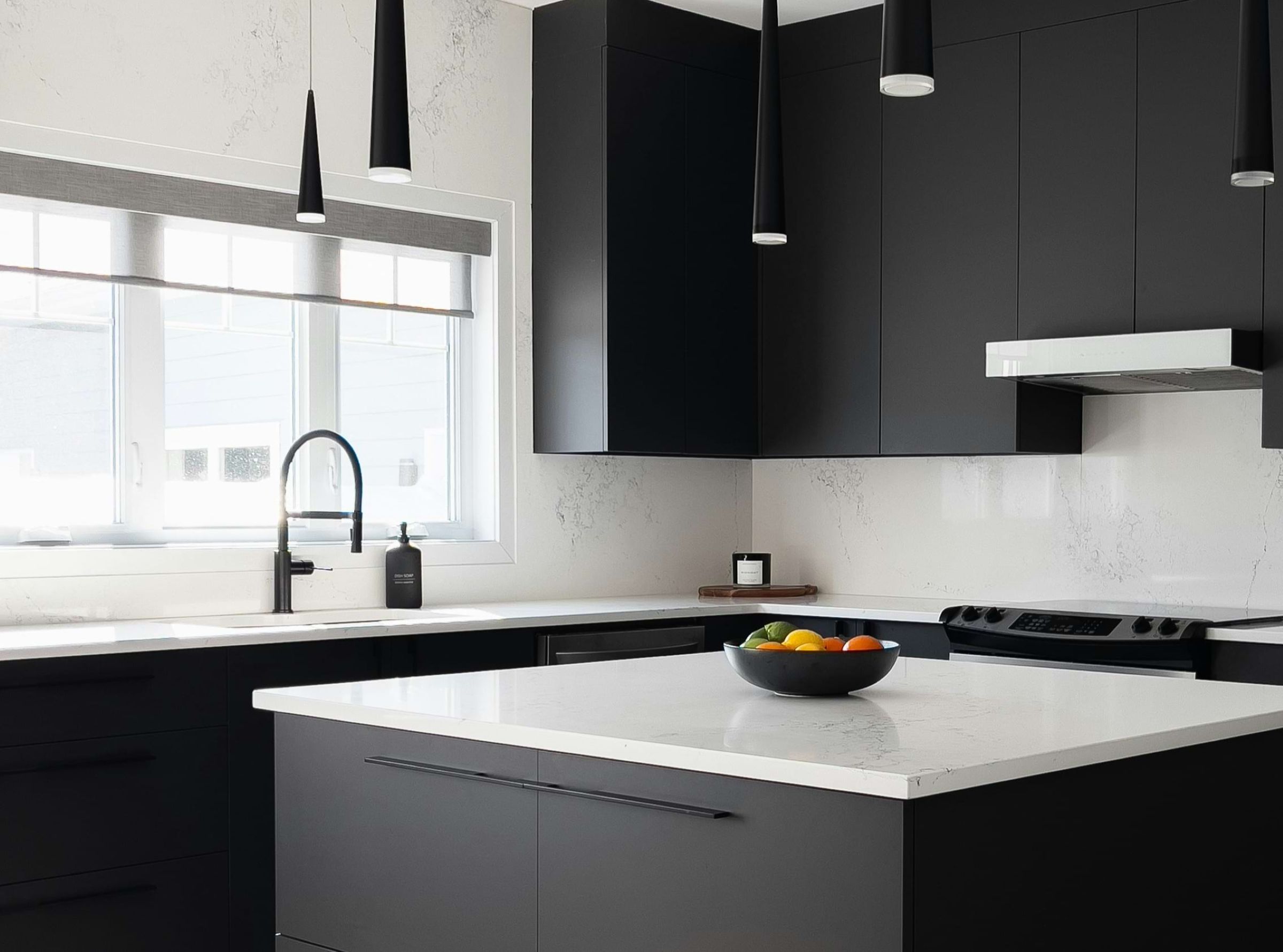
For those who love a dramatic flair, the black-and-white color scheme is a timeless masterpiece. It’s bold but balanced, much like any Tim Burton movie—think Beetlejuice but with better lighting.
Why it works:
- Offers high contrast and visual interest
- Feels modern yet classic
- Can be dressed up with gold, silver, or natural wood accents
A black and white color scheme can deliver a timeless, high-contrast look that exudes sophistication and drama. White cabinets paired with black countertops or a black island create visual balance and focal points. Patterns like checkerboard floors or herringbone backsplashes enhance the dynamic feel. Metallic accents in chrome or brass can introduce warmth and shine.
A black and white kitchen is bold, elegant, and effortlessly stylish—never going out of fashion.
3. Navy and Gold: The Royal Treatment
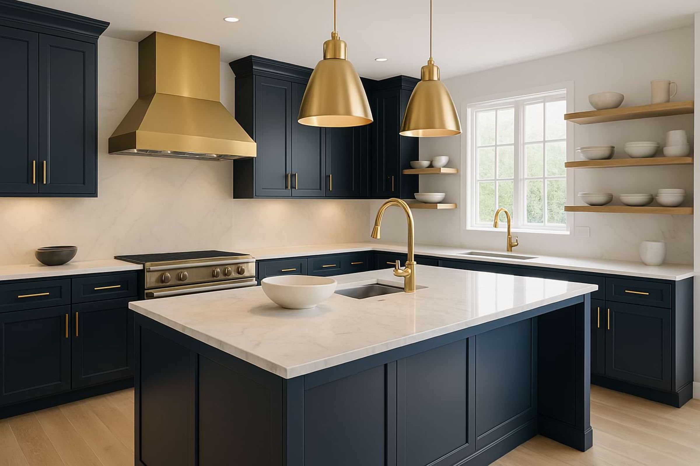
Navy blue paired with gold hardware is the Meghan Markle of kitchen color schemes—classy, slightly regal, and effortlessly stylish. This combo brings a richness to the space without feeling too trendy or overbearing.
Why it works:
- Navy is a strong neutral that hides smudges (ideal for homes with kids or clumsy adults)
- Gold adds warmth and a hint of luxury
- Works well with white, wood, or marble countertops
A navy blue and gold color scheme brings a luxurious and sophisticated ambiance to any space. Navy blue cabinets or islands create a rich, dramatic foundation, while gold accents—such as hardware, light fixtures, or faucets—add a luxurious, warm contrast. This combination works beautifully in both contemporary and classic styles, offering a refined palette that feels timeless yet bold.
Pairing navy with white countertops or backsplashes can enhance brightness and balance. Textured materials like marble, brass, and wood further elevate the look. Together, navy and gold create a timeless palette that feels both regal and inviting.
4. Earthy Tones: The Cottagecore Dream
If you want a kitchen that feels warm, inviting, and like it belongs in a Nancy Meyers movie (yes, we all secretly want to live in It’s Complicated), then earthy tones are for you. Think sage green, terracotta, warm beige, and soft browns.
Why it works:
- Feels cozy and welcoming
- Pairs beautifully with natural materials like wood and stone
- Brings a touch of nature indoors
This color scheme creates a grounded, calming, and welcoming atmosphere. Inspired by nature, this palette includes shades like terracotta, olive green, warm browns, clay, sand, and muted ochres. Earth tones are timeless, soothing, and effortlessly stylish. These colors bring warmth and depth to a space, making it feel cozy and connected to the natural world.
This design pairs beautifully with organic textures such as wood, stone, rattan, and linen. This design approach works well in bohemian, rustic, and modern organic interiors. It encourages relaxation and mindfulness, making the home feel like a serene retreat.
5. Gray and Greige: The Benedict Cumberbatch of Kitchens
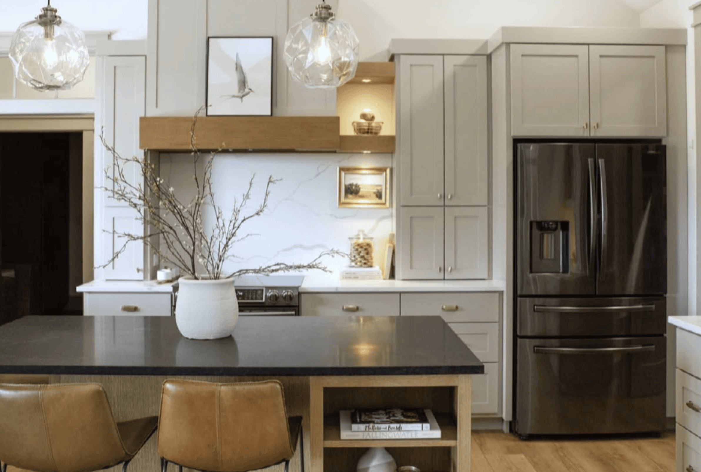
Photo by @terranelsonhome on Instagram
Gray and greige (a mix of gray and beige) are like Benedict Cumberbatch—sophisticated, effortlessly cool, and appealing to a wide audience. This palette is perfect for those who want a neutral kitchen with a bit more depth than plain white.
Why it works:
- Versatile and works with warm or cool tones
- Hides smudges better than white
- Provides a modern yet classic look
The blend of cool gray and soft beige creates a balanced, neutral palette that feels both sophisticated and inviting. This combination works well with a variety of materials, from sleek quartz countertops to natural wood cabinets. It provides a subtle backdrop that highlights textures and finishes without overwhelming the space.
Greige kitchens feel timeless and versatile, easily complementing stainless steel appliances, matte black fixtures, or brass accents. The result is a serene, elegant space perfect for both cooking and gathering.
6. Deep Charcoal and Brass: The Moody Masterpiece
Photo by @apronkitchens on Instagram
If you love a dramatic, moody aesthetic, deep charcoal paired with brass hardware is the way to go. It’s sleek, modern, and makes your kitchen feel like a five-star cocktail bar.
Why it works:
- Adds depth and a luxurious feel
- Works well with marble and wood accents
- Feels cozy yet refined
This combination of colors creates a bold, elegant, and modern aesthetic. Charcoal offers depth and drama, providing a sleek, moody backdrop that makes a strong visual impact. Brass accents—seen in hardware, light fixtures, or faucet details—introduce warmth and a touch of luxury, standing out beautifully against the dark tones. This mix of colors strikes a balance between industrial chic and refined sophistication.
Pairing matte charcoal cabinetry with glossy brass finishes adds texture and contrast. Light countertops or backsplashes can soften the look, enhancing brightness. Together, charcoal and brass deliver a striking yet timeless kitchen design.
When it comes to choosing a timeless kitchen color scheme, the key is balance. Stick with classic tones, natural materials, and a look that makes you happy every time you step into the room. Whether you go for crisp white, moody charcoal, or earthy greens, the goal is to create a space that feels like home—and maybe impress a few guests along the way.
Just remember: if your kitchen looks like a time capsule from a specific decade, it might be time for a refresh. Now, if only picking what to cook in your beautiful new kitchen was as easy as picking the color scheme…
What’s your favorite kitchen color scheme? Let’s discuss (and drool over) dream kitchens together, start your journey with us.
Hudson & Crane is an interior designer in Washington, D.C. serving residential clients in D.C., Maryland, and Northern Virginia.